Hearing the words “corporate website” can conjure visions of a standard 5-page snoozzzzzzzzzz… sorry, what were we talking about? Corporate websites! They don’t have to a complete snooze-fest. They do have to be well-built and easy to use.
One corporate site that hits the mark for both great content and a high quality build is Benevity (benevity.com). Benevity, if you aren’t familiar, is a Calgary success story, developing technology that powers goodness programs and corporate philanthropy for global brands.
With that kind of reach and product offering, Benevity has a rich story to tell. And, being a technology company, it’s no surprise that their website scores high for technical merit.

EASE OF USE
A corporate website should be easy to understand and simple to navigate. Here’s what we like about Benevity, from a usability standpoint.
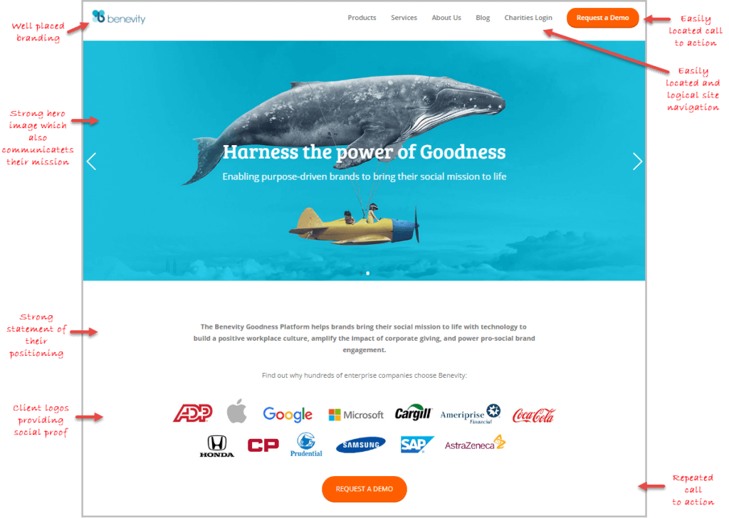
- Well-placed branding. Eye-tracking studies have shown that users look to the top left corner to confirm which website they’re on.
- A strong hero image. A bold image will grab a visitor’s attention, providing an opportunity to communicate your mission or message.
- Introductions. Below the hero image, they’ve stated what they do and explained how their products are positioned in the marketplace.
- Social proof. Client logos add credibility. Knowing Benevity is in good standing with Apple, Coca-Cola, and Honda builds trust with the rest of us.
- Navigation. They’ve done a great job of keeping their navigation simple and easy to follow.
- Calls to action. Websites are sales tools and Benevity’s stays on task, with “request a demo” CTAs prominently at the top, middle, and bottom of the page, to encourage people to try their products.
How do we score Benevity for usability? Unusually usable.
PERFORMANCE
Benevity.com looks great and handles well — but let’s pop the hood and see how it runs.
- Screen test. Built with mobile in mind, the site is fully responsive and adapts well to smaller phone sizes.
- Security. The site uses HTTPS, giving visitors visual cues that the site is secure, trustworthy, and safe to communicate with.
- HTML validation. The HTML has a few minor faults, but mostly passes muster with the W3C Markup Validation Service.
- Style sheets. The CSS has a few minor faults, but gets passing grades from the W3C CSS Validation Service.
- URL forward. The site resolves to just one URL (https://www.benevity.com) and alternate URLs forward correctly to the secure address.
- Accessibility. The site scores well, passing the AChecker validator, but earns a few warnings in the more comprehensive WAVE accessibility evaluation tool.
With our mechanic’s coveralls on, we can say that it’s a well-built website and way better than average.
RECOMMENDATIONS
What would we change? Not much!
- Site speed. The speed in general is a bit slow (scoring only 43% in the GT Metrix tool) and could benefit from some additional optimizations.
- Print styling. A quick print test shows that the print style sheet hasn’t been set up properly, rendering printed pages as a bit of a mess.
- Mobile performance. Tools like mobiReady surface a few minor mobile-friendly issues. Site speed on mobile is a bit lower than average, with Google’s speed test rating the site as “Poor” on 3G. Mobile users might not be Benevity’s main audience for their B2B products, but with the high number of mobile users out there, this issue would be good to address.
All in all, Benevity.com is already a website worthy of a great company making great things possible. A few optimizations would move it even closer to perfection.